More Than Just Caps - Day 1

Created: March 6, 2011
Modified:

PS don't look too closely at the words/quotes I'm using, they're strictly random thoughts and sometimes not too intelligent. Big Grin.

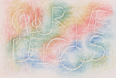
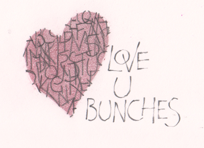
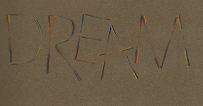
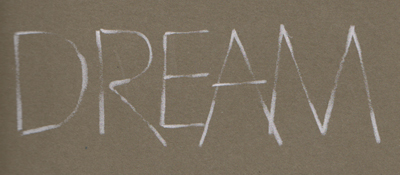
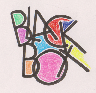
Done with a Zig Writer bullet tip, then colored in with Prisma colors leaving a white border between the color and the letter. We were asked to intermingle our letters which we first did on our practice paper, then copied or traced the letter in the position we wanted for our piece.

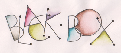
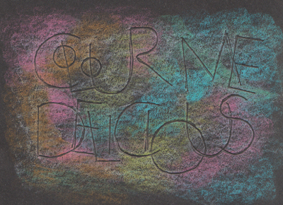
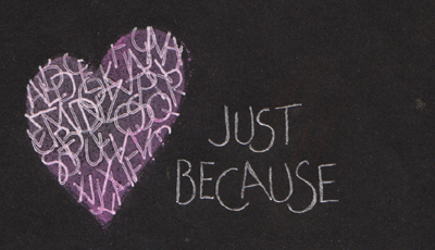
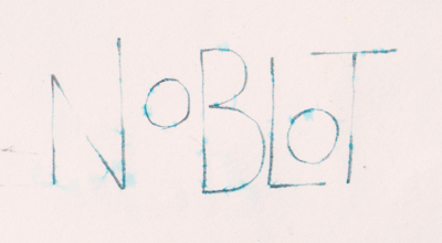
I mistakenly mentioned to one of the students that I used Prisma colors on this piece. On closer inspection I realized I used Derwent Graphatint and moved the color around with my water brush. This started out as a class exercise, but then I added the little balls at the end of the letters.

This is what's called "Blind Embossing" where you take a stylus and do your letters on your paper, but since it's not a pen, you don't actually see the letters. Its creating a channel so the colors you apply next will make the embossing stand out. Done with Prisma colors


this piece is done on Full Spectrum Color Line - Black with a coat of white Prisma colors first and then the colors after.

This sample was an exercise of writing between wavy lines and then coloring or whatever. I decided to do a simple piece using a brown Zig writer and the bullet tip - but very gently so it wasn't too fat, and then just do some doodling within the larger letters. I then accented some of the letters with some pencil shading. I love the look of this piece.

Now we're on to Pressure & Release type letters. I love this technique and use it quite often. This piece was done on Canson Mi-Tientes "Bisque" 4B pencil and Prisma colors.

After the piece at left was done, I thought I'd experiment with different pencils and I think I liked the results from the 2B pencil the best, but each has it's own use.

Love this technique and the result it gives and who would have thought it was this easy...

The exercise was basically shown using a square template cut from a piece of paper, letters randomly written and over lapped within the square, making sure they came off the edge onto the template. Then some graphite was smudged over the square, template removed and you had a great focal point.

I decided to cut out a heart instead and colored it with some pin chalks. Then wrote the rest of my piece in the Pressure Release style.

There was also a sample using the edge of your paper to create your design. Love the way that worked too.

Here's one done on black Spectrum using a white gel pen (Uni-Ball Signo Broad) and then pink chalks. It definitely needed a spray of Workable fixative after.

Thought I'd try a NoBlot pencil with the Pressure Release technique and then gave it a gentle Spritz of water.

A couple more samples of Pressure & Release this one done with a Koh-I-Noor Hardmuth multi colored pencil (love these)

This one done with a white Prisma colored pencil.

Both are done on a grey/greenish tinged mottled cardstock.

This was supposed to be an exercise for the next day, but some of us were a little more exuberant and wanted to try it already...

The sample was done with powdered graphite blended in to the paper and then the letters were erased, then strategically highlighted/accented with a pencil. Not necessarily at the shadow points.

I did both of mine with chalk pastels and just the back of my pencil eraser. will do some more with a bit more care...

Please use your back button for previous images or should you wish to go back to the Romans with Renate Gallery please click on the link below.

Romans With Renate Class

or click on the next button for Day 2


Home Page Index
(text only)
Glass
Gallery
"And More"
Gallery