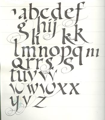
Bone exemplar - is usually a lower case hand
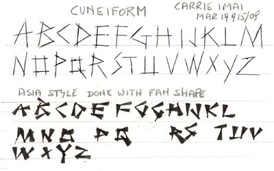
We also learnt a Cuneiform hand and a manipulated Asian style. Fun. The cuneiform is done with the edge of the pen and the Asian one is also done with the edge, but keeping one point stationary as you fan out the other edge.
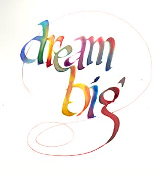
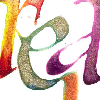
I was just playing and trying to group my letters. It was done on HP watercolor paper with an empty Parallel pen, lots of water to create a convex shape of water on the letterform, then with the tip of a brush drop in saturated colors (Twinkles H2o's). I love doing this technique. It's so unpredictable as to how the colors will flow as the water dries and sinks into the paper.
Detail
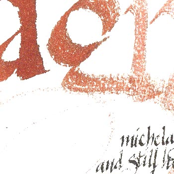
Detail
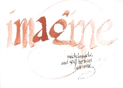
I did the "Imagine" piece on Fabriano CP watercolor paper. The exercise was to load your pen (in this case a piece of doll house shingle attached to the slit in a foam brush handle - foam removed) with ink or color (Pelikan 4001 brown) and keep writing till the ink runs out without reloading your pen. I started in the middle and worked to the right and to the left so my intensity was centered and fading out on both edges. I then used a small Parallel pen to write the quote also with 4001 black ink. Quote: Imagine Michelangelo, and still he was learning.
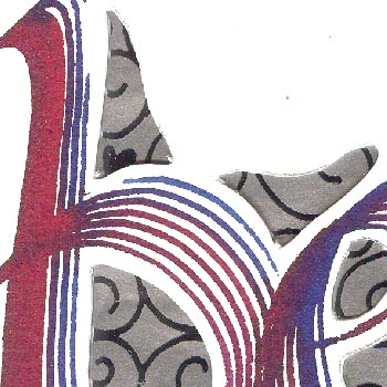
For this exercise we were told to write a word and then cut out some of the negative shapes. Patterned or colored paper was placed under this and would peak out of the cut out areas.
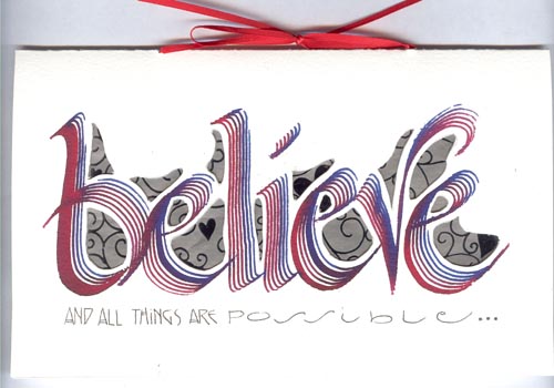
I used the stimudent again (love this tool) on another piece of Fabriano CP watercolor paper and Pelikan 4001 inks. The paper behind the cut outs is a patterned silver foil of flourishes and hearts. I then wrote in my words under this with a micron pen. Tied it with a red ribbon.
Quote: Believe and all things are possible...
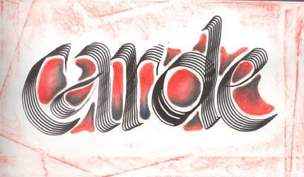
The envelope matches the lettering on the card done with black ink and colored pencils of red and dark blue, then with a red pencil using the flat edge of the pencil on the edges of the envelope.
Generally an "O" because of it's size can be placed into another letter, but in this case I find it made my "o" look like a "d". Will have to play around with the positioning of the letters.
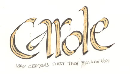
I really like this technique. First we wrote our word, then placed it on a light table so that when we used the colored pencil, we could see to stay within our letter forms. When the wax resist designs were done, we used a water soluble ink and wrote our words again. Where the waxed color was, it resisted the ink making for a very interesting letter.
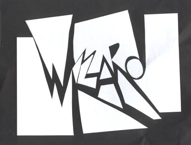
This was the last exercise and we stayed a little later so that we could do them. Lots of fun. We each took a combination of black and white paper, one of which was a small piece and the other a normal 8.5 x 11" piece of paper. On the small piece we wrote a word approximately 4 to 6 letters long with a pencil, making sure each letter either touched the edge of the paper or touched a side of a letter that touched the edge of the paper. Hopefully letters touched both the bottom and top edges and maybe the sides too. We cut the letters out along the pencil lines, and then rearranged or skewed them slightly on the large paper sometimes leaving out some of the negative or positive sections. Needless to say, I spelt my word wrong AGAIN... I just feel wizard should have two "Z's". Anyway, it was fascinating to see everyone's piece.