|
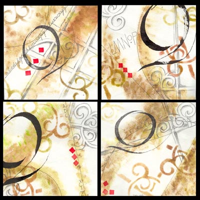
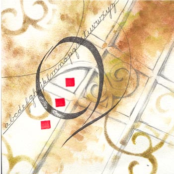
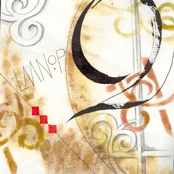
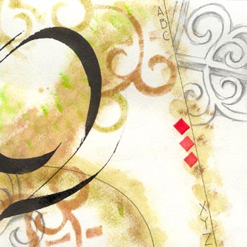
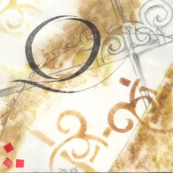
This exercise was an on going two
day job. We cut 4 pieces of good paper (I used Arches Text Wove) into 6"
squares.
1) first part was to sponge on some
color randomly in a neutral tone and using the same colors on each square.
2) Split the paper with a diagonal
line, not from corner to corner in black ink.
3) Then do some calligraphic
lettering, monoline or whatever in black ink.
4) then we were given some
architectural/graphic artwork and had to choose a design or portion as our
drawing exercise. Practice it so we could repeat it on our squares in pencil.
Then draw and enhance sections of it.
5) Then we cut out a stencil of all
or a portion of our design from a clear plastic yogurt top and sponged using the
same or similar paints from the original sponging.
6) we could add more lettering or
more linear lines like curves etc in black ink.
7) The do a calligraphic letter as a
focal item in black ink. I choose the split Uncial "Q" for all four squares
(could have chosen different letters) since it mimicked my flourish ironwork
designs.
8) Last we were told to put some
colored brushstroke squares anywhere on the design.
I don't think I left out any steps,
but there were a lot of them, so who knows...
See larger pics of the squares
below.
|
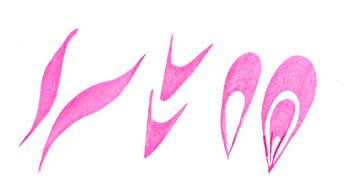 Basic brush strokes