
ID: OTT-Triptych-Never So Lost (unavailable)
|
PP Challenge Over The
Top (1st batch of triptychs)
Created: July 26,
2010 |
|
These are the first batches of Triptychs. I've been in a mood to make them lately. |
|
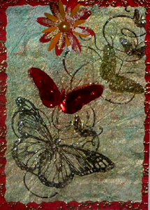
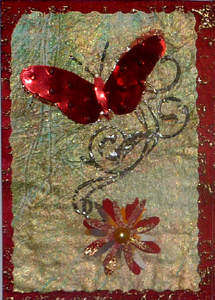
ID: OTT-Triptych-Never So Lost (unavailable) |
|
The butterfly stamps are Stamp-it Australia stamp set #SISET-010, using Versafine Black Onyx, clear embossed on decorated Gesso/Tissue paper background (tutorial coming soon in the Nitty Gritty Gallery). The backgrounds were cut with a deckle edged Rotary cutter. The red background is a bright red cardstock, run through my Cuttlebug with Tim's "Bricks" embossing folder then brayered the high points with Perfect Medium and embossed with gold. Red butterflies are Shimmer Sheetz Metallic Red (available through Elizabeth Craft Designs) and embossed with the Swiss Dots embossing folder. |
Flowers are punched with various daisy type punches from scrap decorated papers and a cream or red half pearl in each center. The quote is a Quietfire Design rubber stamp again with the black and clear embossed. And the doodle on top is a Spellbinders Doodle die on cream cardstock and embossed with Red Dragon embossing powder.
|
|
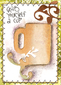
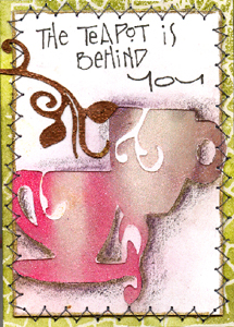
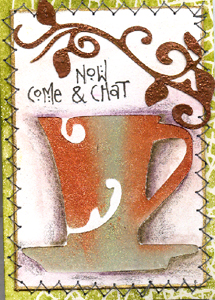
ID: OTT-Triptych-Cup of Tea |
|
I love these cups and the Perfect Pearls just does not show up properly. - sorry The cups were cut with my Cricut from white cardstock, Sookwang tape placed behind the open areas and Perfect Pearls brushed on (Blush/Kiwi; Raspberry/Blush; Forever Violet/Heirloom Gold; Kiwi/Copper). I shadowed the area around the cups with a tombow greyish marker and then with some Prisma Colors. Edged each with a Krylon Gold Leafing pen, Sewed it to my background. |
Background was stamped with Perfect Medium, clear embossed then sponged with Distress Stamp Pads (Peeled Paint, Crushed Olive, Forest Moss), spritzed with water and dried. Lettering done with a black micron pen. Flourish leaf cut with Cricut, and embossed with copper. Words: Grab yourself a cup, the teapot is behind you, now come & chat.
|
|
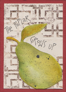
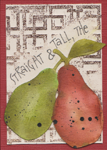
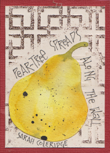
ID: OTT-Triptych- Pears (unavailable) |
|
I love these pears too. I cut them out with my Cricut on 90# watercolor paper, then colored them in with Distress stamp pads and a water brush. When dry, I spattered Moon Palace ink on them. - a few slightly larges dots than I would have wanted, but that's serendipity for you... The background is cream cardstock, which I wrote my words on using a black micron pen, then embossed the design with a mallet and the Oriental Screen folder. |
That way I cut emboss around my words. I then brayered Perfect medium on the high points and embossed with a mix of Queen's gold & Espresso. Mounted them onto a deep cold red Bazzill Monochrome cardstock. Words: The poplar grows up straight & tall, the pear-tree spreads along the wall. Sarah Coleridge |
|
|
Please use your computer's back button for previous images Thank You or click a button below to go to the PP AsianTheme 2010 Gallery
|
or should you wish to go back to the ATC Gallery please click on the link below.
| Home |
Page Index (text only) |
Glass Gallery |
"And
More" Gallery |